

Restraint is not emptiness. It is the courage to leave the extra garnish off the plate.
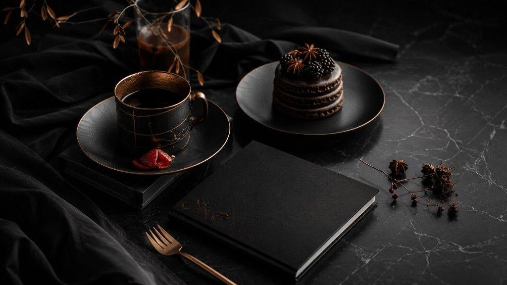
Black marble. A closed book. Coffee in a cup that refuses loud branding. A dessert stacked in three dark discs, finished with blackberry and star anise — garnish counted, not piled. The photograph on this article is a noir still life: luxury without cheerleading. Microcorem’s Bright field note is about restraint as taste and as operating discipline. When everything can be added, the adult move is knowing what does not belong on the table.
What “noir” is doing in a bright series
In Colour does not mean neon every day. Bright field notes include contrast — seasons, moods, and visual registers that sharpen attention. Noir here is not pessimism. It is low noise. The frame earns drama from materials and spacing, not from badges, stickers, or a paragraph of claims floating above the dessert.
Plenty of product surfaces fail that test. They add chips, banners, and “insights” until the plate looks expensive and tastes confused.
Restraint as an editing practice
A still life is an edit you can photograph. Operators need the same edit in less glamorous places:
- One primary signal on a dashboard before the garnish of twelve sparklines.
- One sentence of truth in a status update before the decorative adjectives.
- One owned metric for a release before the vanity set.
- One book — metaphorically — closed on a decision, so the table can hold coffee again.
Luxury without loudness
The copper rim and the blackberry are enough. That is a useful aesthetic for enterprise work that wants to feel premium without performing urgency. Microcorem’s platforms and commerce paths aim for that kind of quiet confidence: materials (data, workflow, interface) doing the work; garnish held back.
A short checklist before you add another element
Before the next deck or surface gets richer, ask:
- What would this look like if we removed two garnishes?
- Is the drama coming from truth — or from decoration?
- Which single object on the table must remain if everything else goes?
- Would a sceptical guest trust this plate, or only photograph it?
What this means for Microcorem
This In Colour note uses a noir table setting as atmosphere for restraint and editorial taste. It is not a hospitality client story, a dessert brand affiliation, or a claim about luxury retail metrics. The real work stays in product engineering — with surfaces that prefer clarity to garnish.